Project overview
uServe is a POS system developed by uP to replace third-party prebuilt systems. The goal was to create a proprietary platform that aligned with the company’s new branding while addressing the specific needs of small businesses. The new system streamlines workflows, improves usability, and delivers a more cohesive experience for merchants.
My role
As the lead designer for the uServe project, I drove the end-to-end design process, from initial research to developer handoff. I worked closely with product managers, designers, sales teams, and developers to create a system that aligned with both brand and business goals.
Trusted by 3,100+ restaurant owners and facilitating $2.8B in transactions, uServe’s prebuilt POS had key limitations.
The problems
For over a decade, uServe relied on third-party prebuilt POS systems. While these systems helped support small businesses, they also caused friction in daily operations. The generic interfaces didn’t align with the uP brand or accommodate the unique workflows of small restaurants, making order management and transactions inefficient. To improve the product experience, uServe needed an intuitive system tailored to its merchants.
Who are the users?
To better understand uServe’s merchant base, we collaborated with sales teams to analyze demographic data from 3,100+ merchants. This analysis provided key insights into our users and shed light on their unique challenges.
Independent, minority-owned businesses often navigate language barriers and operate with distinct workflows.
uServe’s merchants are diverse small business owners, primarily from full-service and quick-service restaurants, with 72% speaking Chinese and Cantonese as their first languages and 18% speaking Vietnamese. This data highlights the importance of a system that addresses language barriers and operational diversity.
To understand uServe merchants' unique needs and challenges, semi-structured interviews were conducted with 12 participants from full-service and quick-service restaurants. The group included restaurant owners and staff with varied linguistic backgrounds, primarily speaking Chinese, Vietnamese and Spanish.
Understanding the needs of uServe merchants.
These insights revealed key frustrations, such as unintuitive layouts, language barriers, and difficulty training staff, alongside positive feedback on features like tap-to-pay and daily sales demonstration.
The need for a more intuitive and accessible POS experience.
Through user research, we concluded two key challenges affecting small restaurant owners and their staff. Limited resources make it difficult to manage orders efficiently, while text-heavy, complex systems create barriers for non-native English speakers and older employees. These challenges underscored the need for a POS system that is faster, more intuitive, and easier to navigate.
+
While the interview feedback revealed practical challenges rather than technical details, it highlighted critical user pain points and workflow inefficiencies. These insights guided a focused design critique, uncovering opportunities to improve navigation, streamline visual hierarchy, and optimize feature prioritization to better align with user needs.
Evaluating the previous design.
User flow
An updated user flow was created to reorganizes essential features and prioritizes intuitive navigation, addressing the challenges identified during user interviews.
Creating wireframes
A series of wireframe were created to illustrate the user flow from placing an order to completing payment.


We incorporated more informative visual cues, such as icons, to improve navigation and accessibility.
The previous design relied on high-contrast colors to organize information and guide navigation, but many users found them distracting and confusing. In the new design, we minimized color usage and introduced more icons to enhance clarity and improve the user experience.
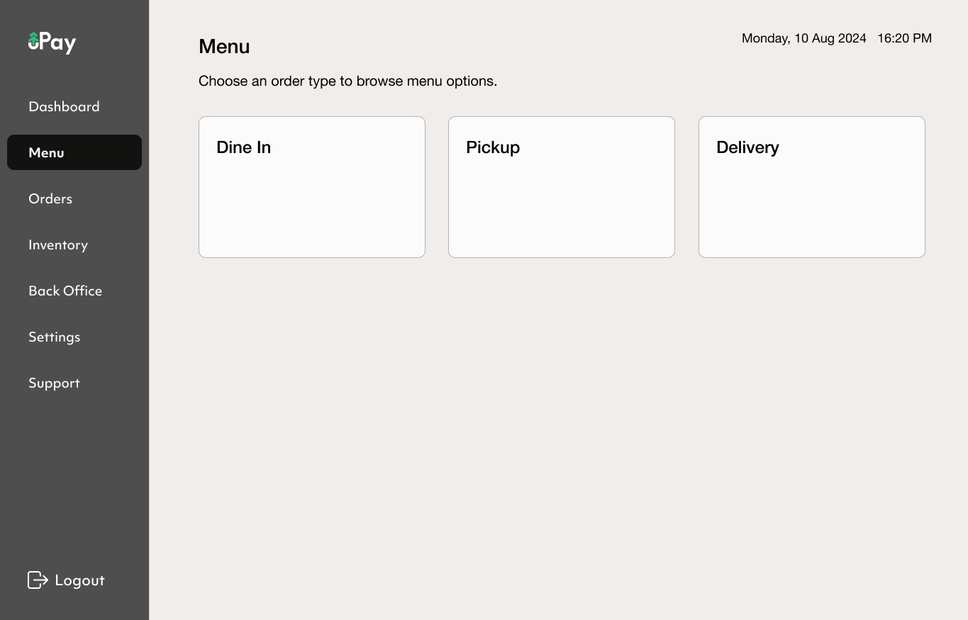
Making menu selection the first step of placing an order.
Decluttering the interface by reorganizing actions and using colors more intentionally.
Most uServe merchants handle multiple order types simultaneously, frequently switching between menus with varying items and prices.
To make this process more intuitive, the new design introduces a dedicated Menu tab in the sidebar, making menu selection the first step of order creation. Unlike mainstream POS systems that start with order creation before assigning a menu or order type, we flip this flow. By choosing the menu upfront, staff can quickly access the correct pricing and items, reducing errors and making it easier to manage diverse order types with minimal cognitive load.
The old system lacked visual hierarchy, with an overload of colors and action buttons competing for attention.
Functions like placing orders, recalling past transactions, managing gift cards, and accessing the back office served entirely different purposes but weren’t clearly distinguished. Through iterative prototyping, we refined a sidebar-based navigation that prioritizes the most essential functions to maintain clarity.
The new design uses color with intent, reinforcing associations and minimizing cognitive load.
Making order creation more intuitive with a clear, receipt-style layout.
After observing staff using the POS, we found that placing an order is a critical step where speed and accuracy directly impact workflow and customer experience.
To streamline this process, we designed the order summary panel with a modular receipt-style layout, ensuring that key details like items, quantities, prices, discounts, and totals are clearly displayed. This approach reduces visual clutter, making the interface more intuitive and minimizing cognitive load for staff.
Keeping primary actions clear, secondary actions accessible.
Users often struggled to find actions like voiding an order or applying discounts. By grouping these less frequently used actions under a dedicated Actions tab, we keep the Check tab clean while ensuring staff can still access important functions quickly when needed.
Clear icons accompany each action, helping staff understand their function without relying solely on text.
Tracking and managing orders with an easily scannable layout.
Besides order creation, managing ongoing orders is one of the most frequent and time-sensitive tasks for restaurant staff. Instead of a dense list, the new design organizes orders into separate cards, allowing staff to scan key details at a glance.
We spent some time observing staff juggling multiple tasks during busy hours and noticed that frequently changing order statuses, like marking an order as ready, needed to be faster. To make the process smoother, we added a status update button directly onto the order card, allowing staff to update an order’s progress in a single tap without needing to open the full order details.


