VISUAL DESIGN / B2B FINTECH / MULTIMEDIA / 2024
Reimagining a fintech brand, from Logo to business collateral.

Overview
My role
I worked with a cross-functional team that included 2 product managers, 3 graphic designers, 1 copywriter, and leads from marketing, sales, and legal teams.
Logo
The new logo is designed to resemble a tree growing in a pot, which symbolizes growth. This represents uP’s commitment to promoting customers’ growth.

Color
The new uP brand embraces a brighter blue and a new bright green color to express the brand’s ambition to be non-traditional and its dedication to innovation.


Font
Objektiv MK1 was chosen as the brand’s new font for its modern look and readability.

Social media
uP’s rebrand was presented to the public through a series of social media campaign.

Business collateral
uP’s new branding was also reflected in updated business collateral including folders, business cards, and sticky notes.


Presentation Design
Internal presentation templates were updated to ensure readability and a consistent brand image.

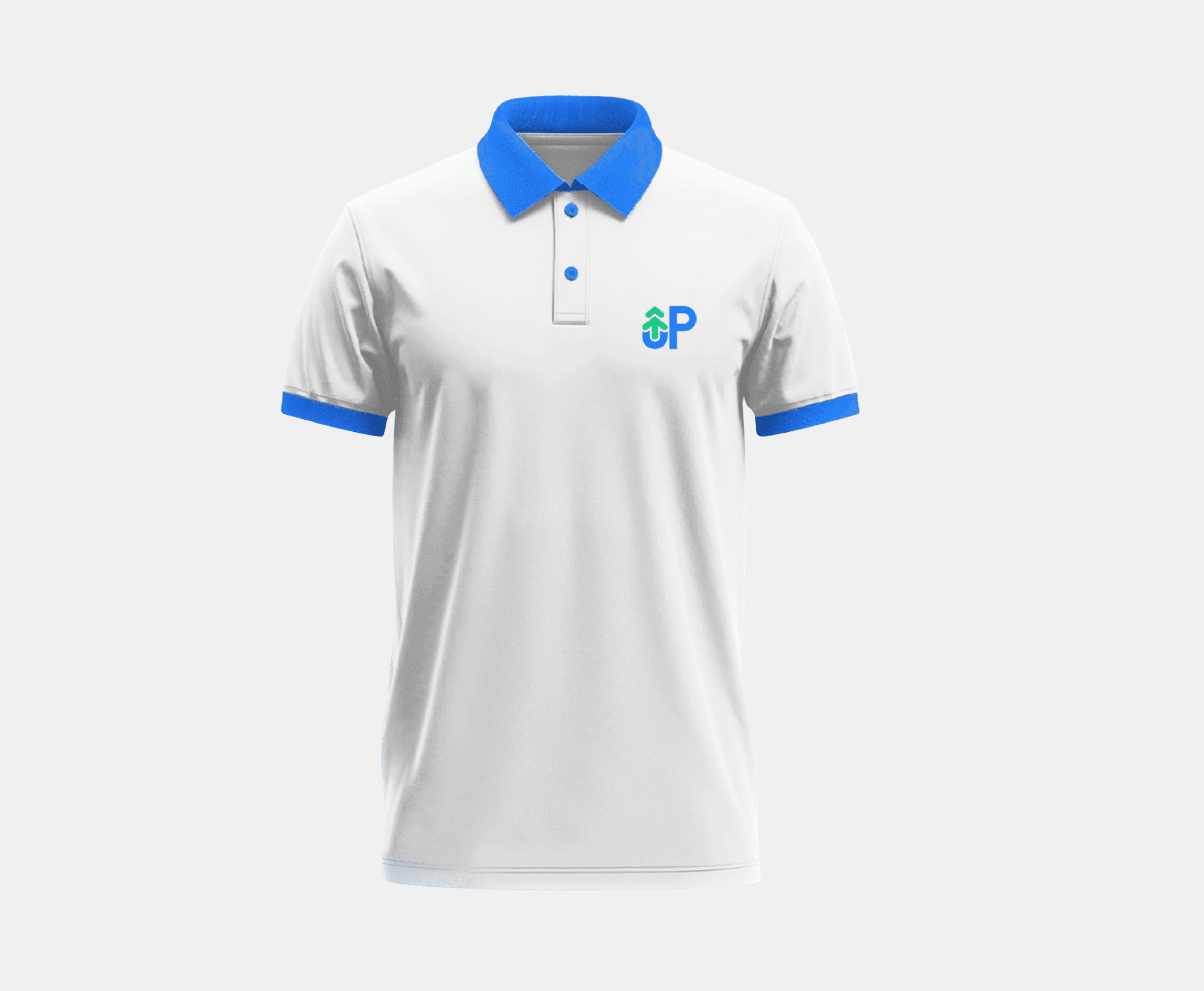
Company t-shirt
The company t-shirt embraced a new design that reflects the brand's updated style — clean and modern.
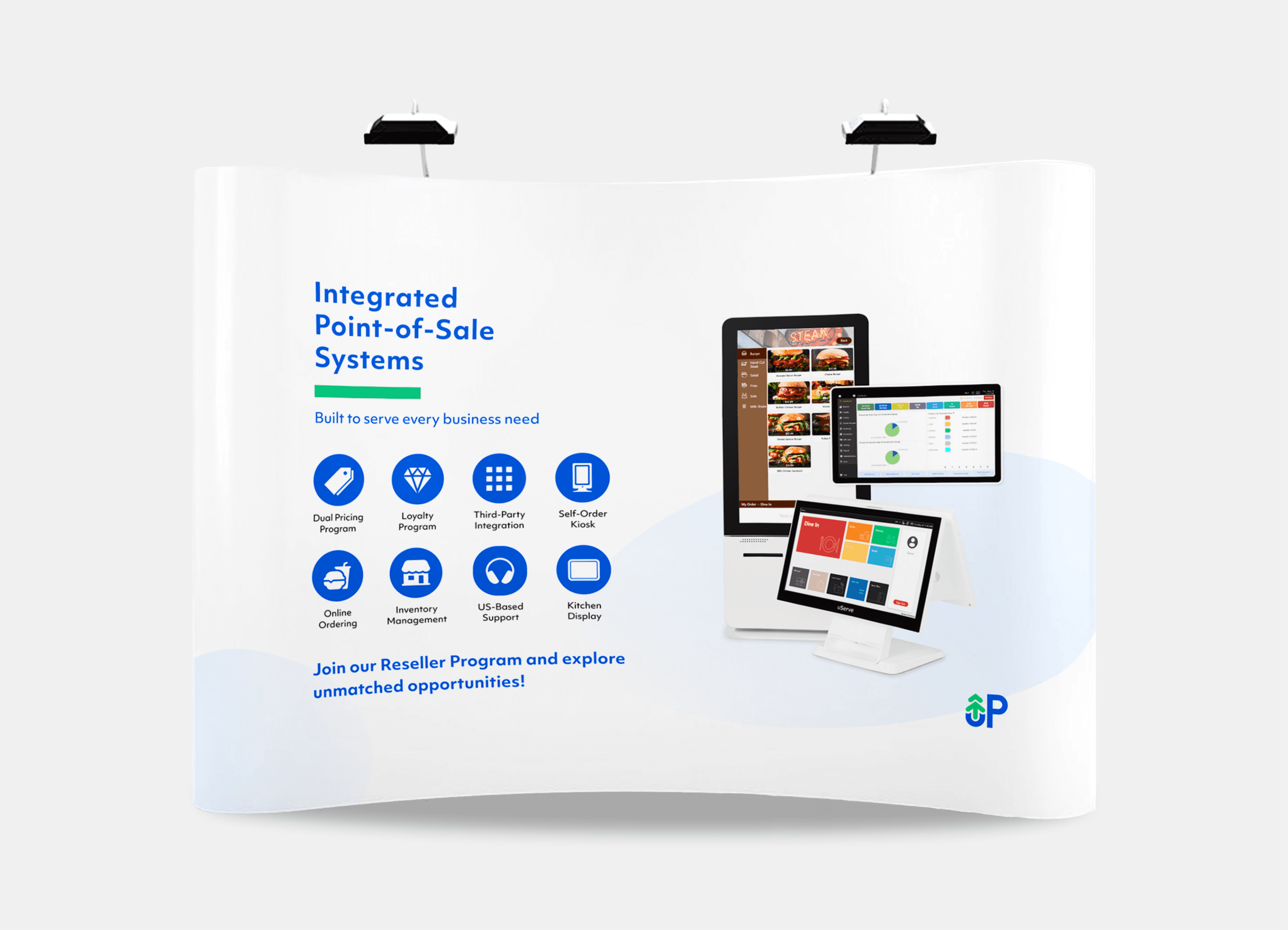
Tradeshow backdrop
The backdrop was designed to showcase key features of uP’s point-of-sale system in a clean, engaging layout, tailored for maximum impact at trade shows.
© Wenju Huang 2025